Subscribe
Tutorial Index
Photoshop Chrome Type Tutorial
 There’s tonnes of Photoshop Chrome Type tutorials online, so this is hardly breaking new ground in the field.. As the majority of walkthroughs covering chrome type are quite dated and garish, I thought I’d share a process that looks more contemporary / refined. The bulk of the work involved is hands-on, but this allows greater creative control, producing a sleek finish that works great with logos.
Cinematic Type
The trick with this one is to inject a sense of drama using simple lighting techniques. Here is the finished example piece, produced for 2Shy MC:
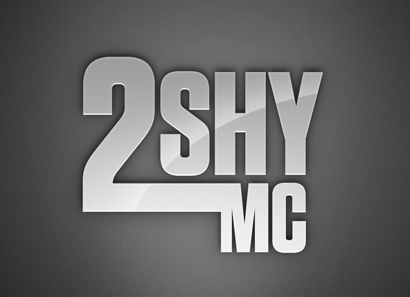
Clean san-serif type will work best for this walkthrough, overly-detailed logos or typefaces most likely won’t work as well..
The Background
For the effect to be succesful, a very dark background is required. The background in this case was produced using the Instant Backgrounds in Photoshop technique, be sure to check out the walkthrough for creating these basic backdrops:

In this case, a very slight noise (Filter > Noise > Add Noise) was added just to apply a bit of texture and take out some of the ‘gradient banding’ that occurs.
Bring on the Type
Use the Type tool (T) to create your text or import the logo you want to work with, ensuring it is plain-white #fff:
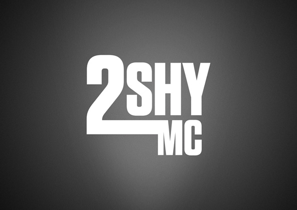
Again, it is worth noting that simple, modern typefaces will work best for chrome effects (Tungsten, Knockout, Trade Gothic, Eurostile etc.)
Applying the Effects
To start with, we are going to work with the blending options – the primary effect being a simple gradient overlay. Right click on your Type layer and select Blending Options; within the dialog choose Gradient Overlay. Within the Gradient Overlay settings, click on the gradient to bring up the gradient options, here you can determine your colours and more. For this technique, you require a dark shade of grey as well as a lighter shade. Check out the settings used below:
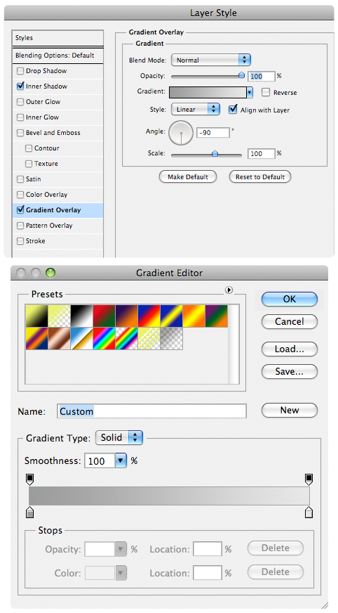
Another important setting to make note of is the gradient direction, in this case -90°, giving the illusion that the light is travelling upwards ^ with the lighter colour at the bottom, slowly dissipating into a darker shade.
With the gradient in place, it’s time to apply another blending effect – this time a very subtle inner shadow set to a lighter colour to bring out the edges of the type a bit:
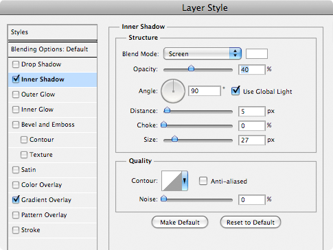
I was working very large with the example piece, so feel free to tweak these settings as necessary for your own work. It’s worth naming this layer ‘Main Type’ or something similar. Here is what we have so far:

Faux 3D
Duplicate your Main Type layer (Ctrl / Cmd + J), remove all blending styles from the duplicate (right-click layer, select ‘Clear Layer Style) and drag it underneath your stylised version in the layer stack. With the Move Tool (V) selected – nudge the plain white duplicate a few pixels down. This basically creates a very basic ‘faux 3D’ effect, and represents the light catching on the bottom surfaces of the type:
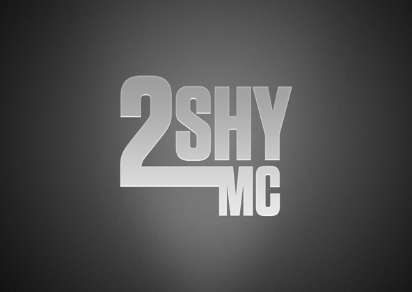
Deep Shadow
Bringing in a nice deep shadow lifts the type from it’s background. Im not overly keen on the use of ‘Drop Shadow’ so in this example we use another method. Duplicate your Main Type layer, clear the layer style (right-click layer, select ‘Clear Layer Style’) and invert it so it is pure black (Ctrl / Cmd + I). You may also need to ‘Rasterize’ this type layer to edit it, so in that case right click the layer and select ‘Rasterize Type’. Bring this pure black layer to the bottom of the layer stack and name it ‘Shadow’. Apply a slight Gaussian Blur (Filter > Blur > Gaussian Blur) using a setting relevant to your document size, so you get something like this:

Duplicate your Shadow layer and apply an even wider Gaussian Blur to the duplicate. With both shadow layers selected (hold down Ctrl / Cmd to select multiple layers), use the Move Tool (V) to nudge them upwards – this gives the illusion that the shadow is cast up from a lower light source. Tweak the opacity of each of the shadow layers to find the right balance, in the example Shadow layer 1 is 74%, Shadow layer 2 is 40%:

A little Flare
These last two touches just increases the glossy nature of the type a little. The first step is to add a white glare – create a selection of the Main Type layer (Ctrl / Cmd + Click layer), create a new layer above (Shift, Ctrl / Cmd + N) and use a very large Soft Edged brush to paint in the glare to the bottom right:
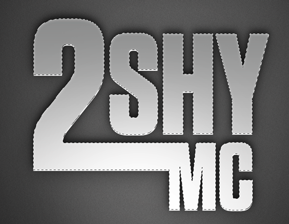
Change the layer mode of the glare to Overlay, and pull the opacity down to around 40% to soften the intensity.
The second step for adding the gloss-factor, is to create the angular swoosh which denotes a reflective surface. Create a new layer at the top of the layer stack set to Soft Light, and using a selection tool such as Pen Tool or Elliptical Marquee Tool (M) – create a curved selection. Inside the curved selection, use a Soft Edged Brush (B) to gently paint at the edges and then deselect when done (Ctrl / Cmd + D).
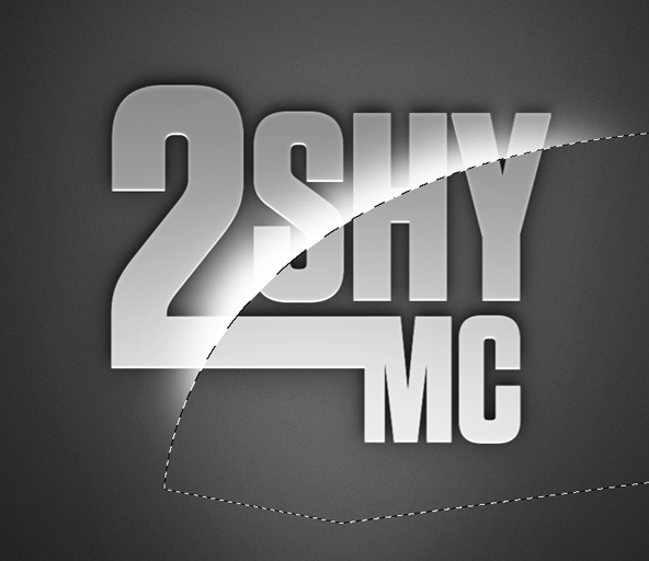
You will need to remove the parts of this white glare that overlap the edges of the type. To do this, create a selection of your Main Type layer (Ctrl / Cmd + click Main Type layer), invert the selection (Shift, Ctrl / Cmd + I) and hit delete on the glare layer, leaving just the effect:
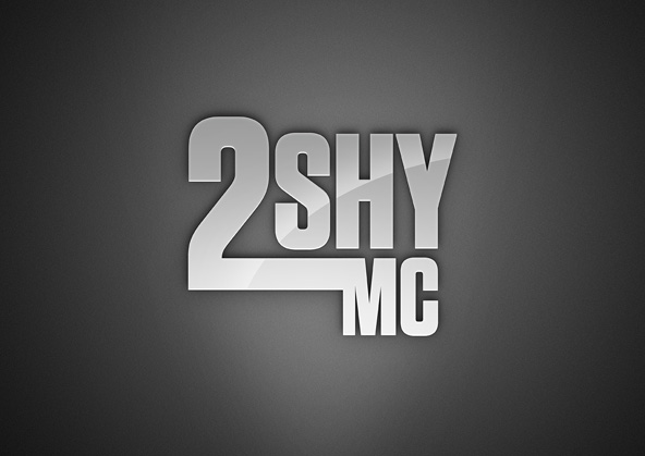
Review
Going the extra hog produces more refined results, and good ol’ Photoshop can still hold it’s own in the creation of type effects. Got your own techniques? Please feel free to share in the comments section below.
Conzz ![]()
Follow on Twitter >> @Conzpiracy
Simple,but looks really good
Much appreciated Glenn
[...] the original : HERE photoshop, [...]
Sweet. Very simple tutorial! It should be easy for everyone to follow
Thanks again Tansie!
[...] Photoshop Chrome Type Tutorial [...]
Well this looks really good This definetly inspires me to create my own logo for pc game. but I would like to create that a bit more for fantasy… besides I am not sure how it should look still…
  gotta kick my a*s to figure it out and then come here and convert the thought to art..
Just give it a go, and take it from there! Best of luck
You get combos when you match 3 balls of one color, then they disappear which causes a match of a different color,
and you could get matches of several colors that way for quite a
few points. While the rest of the world is enamored with the arrival of Google+ and
caught up in the churning activity room that is Facebook,
we’d like to at least wave a red flag of reality through a weekly scam list we put up. Finally, the wonderful thing about massage networking at conferences is that you get to travel as part of your profession, and can experience the different types of modalities practiced by massage therapists around the country.
Muchas gracias!!! excelente tutorial. Facil de aplicar con efectos geniales!