Find Us On:
Muertos Style Photoshop Tutorial
 When explaining the art of Photo Manipulation to the un-initiated, I always use the analogy of ‘collage on steroids’. For our latest Muertos inspired tutorial, that metaphor rings particularly true! In this walkthrough we’ll use compositing techniques to pull together various stock resources to create an elegant Dia de los Muertos piece. There are no special tricks required here, just a stubborn, patient nature to cut out all the elements!!
Tattoo Style
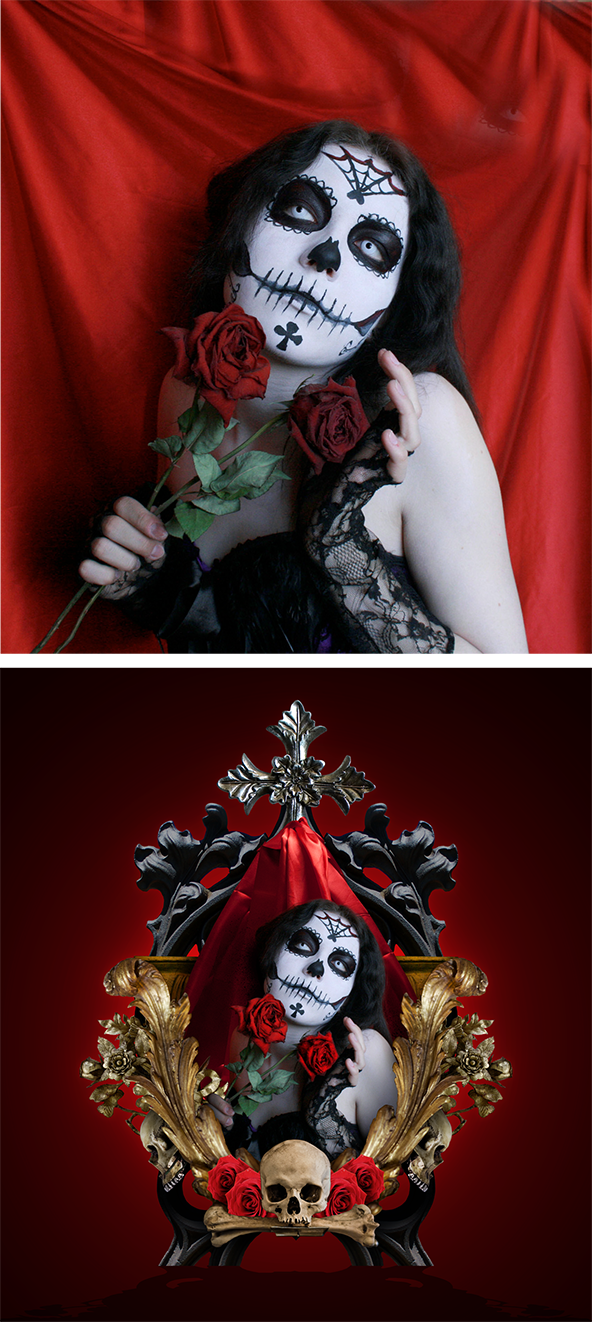
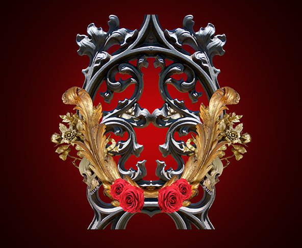
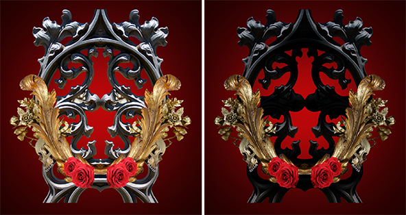
The look for this composite is heavily inspired by the ornate Tattoo aesthetic; swirling flourishes, bold colours and an intricate build up of elements. The final result has an ‘altar’ flavour to it, which is fitting for the Muertos theme of paying respects to the dead. Here’s a look at the primary stock element, and the final result after our work:
Be Prepared
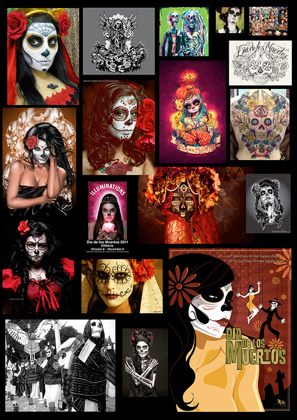
As Im no expert on the Muertos Festival (Mexican Day of The Dead) or it’s aesthetics, I put together a mood board to get a feel for the style. A mood board is simply a big collection of images on one page, that you can glean ideas from – I usually construct mine inside the document, so I can hide and show the layer quickly.
Sometimes art takes a bit of prep work / research, and I’d sincerely urge you guys to give it a go if you’re not already working like this. Your work WILL improve as a result!! Here’s the mood board put together for this piece:
The Art of Stock
The true ‘skill’ with this particular walkthrough is seeking out the required stock elements to make this look work. Hunting stock is an artform in itself, so I’ll run through some of the major considerations to have in mind for this stage of your project.
Keywords are KING.
To get the right elements for your composite, you’ll need to have a firm grasp of using keywords to seek out those elusive elements! The following keywords will pull up fixtures and fittings for creating an altar piece like the one in the example. Each word is linked to the relevant gallery within the DeviantArt stock library – please respect the individual stock artist’s terms and credit them when submitting your work to DA! ![]()
Element Keywords: ornate, iron, floral, rose, skull, decorative, satin
Model Keywords: muertos, day of the dead, candy skull
Ideally, I’d like you to get in the habit of seeking these elements independently, but…. If you would like to use some of the elements seen in the example piece, please check my Stock Resources gallery folder at DeviantArt, and you’ll be able to find everything you need for this piece!
The Primary Stock Element
The focal point for this composite is a girl (or guy!!) with ‘candy skull’ Muertos makeup. For the example I used the image ‘Muertos5‘ by MysteriaViolentStock (DeviantArt) – to make your piece unique, use the ‘Model Keywords’ above for alternative poses and model interpretations ![]()
Compositing
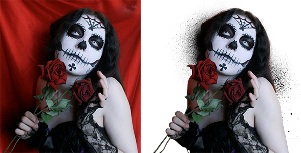
Cutting out the stock model element is usually the first thing that occurs, after the initial setup. I use a ‘two-pronged’ attack when cutting out models – Pen Tool (P) for cutting out the sharp elements such as clothes and body, and Refine Edge for dealing with the hair. This walkthrough is extremely Pen Tool heavy, that’s what gives a composite like this it’s sharpness – there’s just no other way to achieve this look. If you’re not familiar with the Pen Tool, here’s an early video walkthrough I put together, explaining the basics:
Aside from the Pen Tool, it’s also worth getting to grips with Refine Edge, which is pretty much indispensible for dealing with complex selections such as hair. This feature starts to get really good from CS5 onwards, so if you’re using a previous version of Photoshop – well, Im sorry about that ![]()
This walkthrough by Terry White explains the phenomenal Refine Edge function perfectly:
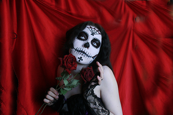
Using a combination of both these tools, you can efficiently ‘cut-out’ any figurative stock element, regardless of how complex the model’s hair may be. Because a few details got lost in the shadows of the source image, I used a ‘Spatter Brush‘ to add a little detail and activity to the left of the hair:
Background
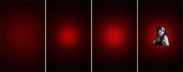
Use a simple Radial Gradient to create the background for your composite. A Radial Gradient pulls the focus in on your focal elements, and adds a bit of ‘pop’ – much like vignetting in Photography. Ive actually started using a better method for creating Gradients in Photoshop, as I found the ‘Gradient Banding’ issue quite annoying!!
Create a new layer at the bottom of the Layer Stack – fill it with any colour (Cmd / Ctrl + A, selects all > Alt + Delete, fills with foreground colour). Right-click on this layer, and select ‘Blending Options’. Use a similar setup to the one shown below, I chose to use reds for the example piece:
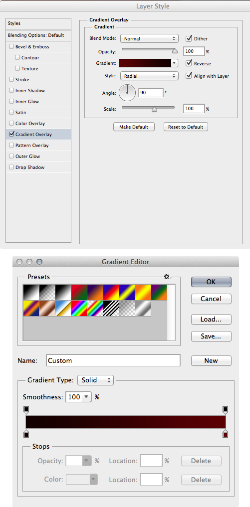
The important button to tick is the ‘Dither’ option, this elminates a fair amount of the gradient banding, so your radial gradient appears smoother than if it was done using the standard Gradient Tool in the document!! ![]()
The above steps will give you a good ‘base’ to work with, but there’s more you can do to accentuate the gradient. You can use Levels Adjustment Layers to tweak the intensity, or add new layers set to Overlay and paint using a white, large Soft-Edged brush to add brightness – there’s tonnes you can do! Here’s a look at some of the experimentation used to get the example piece looking right:
Constructing the Altar
This part of the project is where the real elbow-grease occurs!! Once you have located your ornate Stock Elements, you now get to enjoy the arduous process of cutting everything out, using the Pen Tool (P). Again, there’s no trick to this, and it’s a repetitive task that many folks won’t have the stamina to do.. If you are that special kind of freak, then you get to bask in the glory of showcasing your uniquely complex photo manipulation work online!! (Just like your uncle Conzz) ![]()
Here are the elements used for the example piece (elements not to scale!):
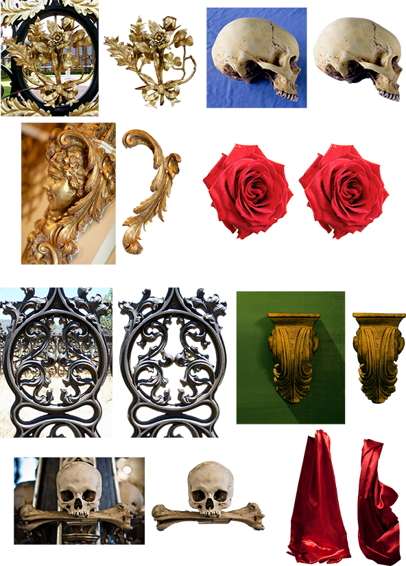
Stock Credits:
Ornate Flower Fence by Photographic-Moki, Side-view Skull by thalija-STOCK, Decorative Flourish by Kendra-Paige, Rose by darkerose42-stock, Iron Fence Design by TheArtistDarklady, Skull with Bone from StockXpert (site defunct), Ornate Cross (not pictured) by Gothicmamas-stock, Satin shot by me
Arranging the Elements
This style of composite relies heavily on symmetry for the effect, so you will have to duplicate your element layers. To start, you can rotate or scale the element using Transform (Cmd/Ctrl + T) – once happy with the scale and positioning, duplicate the layer (Cmd/Ctrl + J) and flip horizontal (Edit > Transform > ‘Flip Horizontal’). Position using the arrow keys on the keyboard, hold down Shift to make the nudges move faster!!

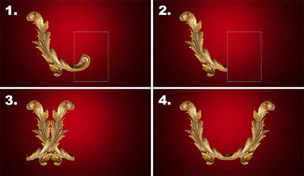
You may want to tweak the elements to achieve a seamless ‘join’. Here are the steps to do that, with illustrations:
1. Create a selection over the area you would like to remove from the element using the Rectangular Marquee Tool (M).
2. Hit ‘Delete’.
3. Deselect (Cmd/Ctrl + D), and duplicate the layer (Cmd/Ctrl + J).
4. Nudge the element using the arrow keys on the keyboard, and merge the layer down when you are happy with the positioning (Cmd/Ctrl + E).
Rinse and Repeat
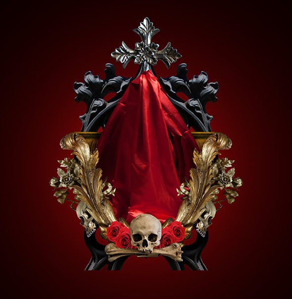
Using the techniques outlined above, build up your ‘altar’ with your various elements.. Ive hidden the focal model stock for illustration purposes, for your own you’ll want your model visibile to see how the components frame the central focal point.
Beefing up the Tones
Many of the elements may be a bit bright or garish, so you’ll want to add a bit of processing to make everything a bit more ‘coherent’ in terms of tone and brightness. There are many ways to achieve this, here is one of my favourite methods for beefing up those tones, to get everything tighter..
Here’s a look at the first element layer, without any processing:

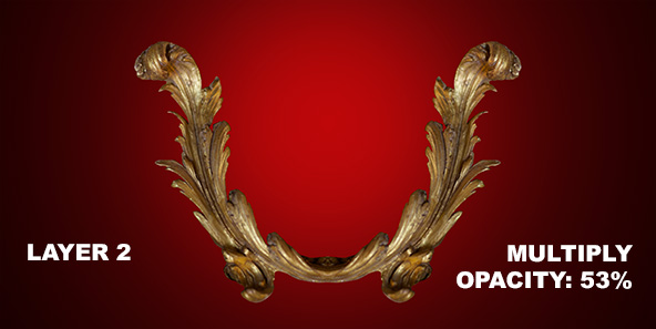
Duplicate the layer (Cmd/Ctrl + J), desaturate the duplicate (Shift, Cmd/Ctrl + U) and set the Layer Blend mode to Multiply. Tweak the layer opacity until you get the desired look:
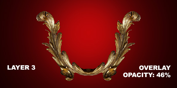
You can pull out the tones further, by duplicating the Multiply layer (Cmd/Ctrl + J) and changing the blend mode of the duplicate to Overlay. Tweak the opacity once more as required:
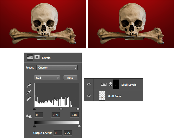
At times you may want to use a Levels Adjustment Layer or something similar to tweak the tones.
In this example, a selection was made of the element (Cmd/Ctrl + Click the Layer Icon), and a Levels Adjustment Layer was added from the Adjustments icon at the bottom of the layer stack. The values were tweaked to make the skull darker. The effect is only applied to the skull, because a Layer Mask is created based on the initial selection. Nice and fast!!
Here’s a look at the elements, ‘pre-beef’ and ‘post-beef’!
Non-Symmetrical Elements
It’s always good to bring in ‘non-symmetrical’ elements to add a little counter-balance to the piece. Here’s some additional props that further build the scene, and processed like the previous elements:
Shadows
Subtle shadows can really lift a piece and add a realistic tactile quality. The methods used for this piece were shadows painted on a new layer set to Multiply, and also the use of Levels Adjustment Layers set to Multiply. Ive written more on the use of shadows, which you can find here: SurrealPSD Shadows Tutorial.
Here’s a look at the shadow effects in place for the example piece:
A Bit of Sharpening Sir..?
Personally, I like to give the final composite a good ‘kick in the face’ in terms of sharpness!! This is personal preference, and not essential to this walkthrough. If you’d like to know my secret recipe for Cinematic Sharpening, check out the video tut I recorded below:
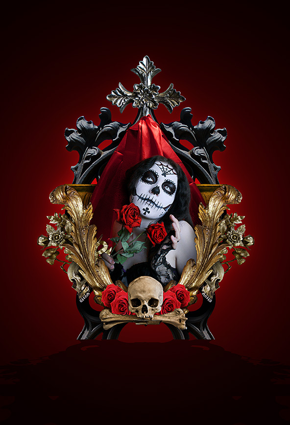
BOOM, and She’s Done!!
The final composite with the model layer visible, in it’s full skullified glory:
Review
Definitely one for the Pen Tool weirdos, however Im certain there’s some dribs and drabs in there that will help out with any type of composite work.. Did you know our full course has been unleashed into the wild? Go from Photo Manipulation ‘Zero to Hero’ in 30 days with our ground-breaking course Art System Photoshop!!
I hope you guys enjoyed, and don’t forget to tell your friends ![]()
Conzz ![]()
Follow on Twitter: @Conzpiracy
[...] 4. Muertos Style Photoshop Tutorial [...]
I just read through the entire article of yours and it was quite good. This is a great article thanks for sharing this information. I will visit your blog regularly for some latest post.
[...] Link: https://www.surrealpsd.com/muertos-style-photoshop-tutorial/ [...]
[...] Link: https://www.surrealpsd.com/muertos-style-photoshop-tutorial/ [...]
[...] Muertos Style Photoshop Tutorial [...]
Is it possible to list basic steps to re-painting a wood fence.